
Posted in Digital Commerce
June 16, 2016
Mobile ecommerce trends — Are you missing out?
Many of you are aware that mobile has been a steady trend. In fact, you hear it all the time “mobile is the future.” I would like to start this post off with a bold statement: mobile is now; it is no longer a future thing. It isn't something you should be preparing for or looking to get into in the future; it's something you need to be aware of from this day forward if you want to grow your ecommerce business.
“Mobile sales currently account for as much as one-third of U.S. ecommerce sales.”
This article aims to educate you and help you understand how powerful mobile is. I want to show you the trends, statistics and what you need to be doing if you want your ecommerce business to succeed in the mobile world.
With that said, let's have a look at some of the mobile trends over the last couple of years and predictions.
Mobile trends
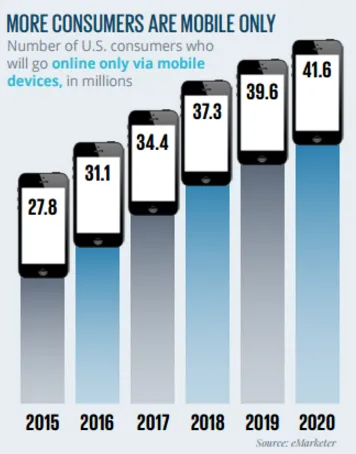
The number of consumers who will go online ONLY via mobile devices, in millions.
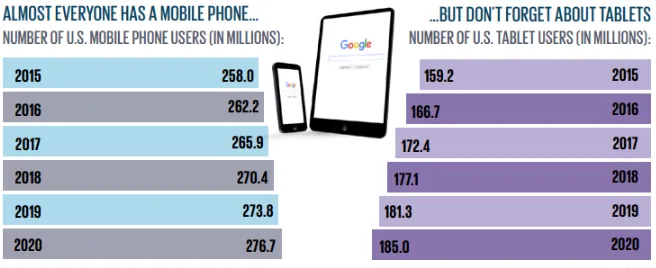
Now let’s have a look at how many people own mobile phones and tablets.
Ok, now that we know that everyone has a smartphone, that doesn't necessarily mean that they are using their phones to purchase products online or browse the web. To back this up I thought I would dig into the analytics of some of our clients here at Acro Commerce and show you first hand exactly what is going on.
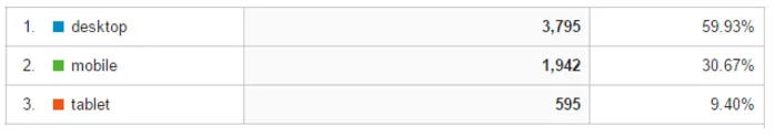
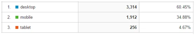
Lite Glassless Mirrors
This is a company that sells glassless mirrors and if you look at their analytics below you will notice that 40% of the traffic going to their website over the last 4 months is coming from mobile phones or tablets.
Eikon Device
Eikon sells tattoo equipment and from looking at their analytics you will notice that OVER 50% of their traffic comes from mobile phones and tablets! This is a crazy statistics to look at. Mobile is actually more popular than desktop. I believe this number will only continue to grow.
Value Calendars
Value Calendars sells calendars online through its ecommerce store. Over the last 4 months, just under 40% of their traffic was coming from mobile.
Note: Before we took Value Calendars on as a client they did not have a responsive design. In fact, after rebuilding their site, giving it a new look and making it responsive (mobile friendly) the average visitor duration increased by 49% and the mobile bounce rate decreased by 27.79%! This just goes to show how important it is to have a mobile responsive design.
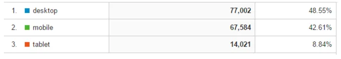
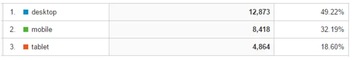
Crave Furniture
A company that sells furniture online. Again, just over 50% of all the traffic coming to their website over the last 4 months is coming from Mobile.
As you can see, it won’t be long before mobile starts to dominate desktop traffic. It is steadily increasing and more and more people are going to use mobile as time goes on.
You need to get the thought out of your head that “mobile is the future”. Looking at the proof above we can easily say MOBILE IS NOW and start to say “desktop is a thing of the past”.
What does this mean?
This means more and more people are going to start buying and interacting with your brand via mobile. This means you need to do everything you can to create the best user experience via mobile. This includes the way you display your content, how your products can be viewed, user path, etc.
It’s one thing to have a responsive website and it’s another to have a responsive website that makes the user experience enjoyable and as simple as possible. This alone is going to be the difference between brands that succeed with mobile and brands that fail.
Six ideas to follow when designing a mobile user experience
Make your content clear and simple
When designing your mobile user experience you will want to keep things as simple as possible. Have a clear objective of what you want your site visitors to do when someone lands on your website via mobile and create a simple layout and design that guides those site visitors through that process.
Most of the time when you try to add everything that is displayed on a desktop into a mobile device things can become cluttered and confusing. The more simple something is, the better it will be for the user and you.
Simplify your menus
Most websites already do this well, but when you are adding your menu to your mobile design, you will not want to have tabs running across the screen like a desktop. This can take up precious space that you will need for displaying other content. The best way to work around this is by having a menu icon that drops down.
NOTE: Try to avoid having multi-level menus on mobile. This can cause a very bad user experience and confuse most people.
Use different layouts
Not all mobile devices were created equal. There are many different sizes of phones and tablets; you will want to make sure when designing your mobile user experience that you create something that is going to work across all platforms.
This can be a very difficult task to accomplish when using standard CMS and ecommerce platforms that don’t allow customization. With the new Drupal 8 release, this is automatically done giving each and every one of our clients the best possible design for each platform.

Design it for touch
Have you ever had the experience where you go to click something (button, link..., etc.) on a website via mobile and then end up accidentally clicking on an entirely different button or link because the content wasn't spaced out properly or displayed in the best possible way? I think we have all done that at least once.
When designing your mobile experience you will want to consider that you are creating something for the hands, not a keyboard and mouse.
Forms are the enemy
People's attention span is getting shorter and shorter every single day. We are not patient and the longer it takes to complete a task the less likely we are going to complete it.
This applies to filling out forms on a mobile device. Any form that you want someone to fill out via mobile should be short and straightforward. Make it easy for people to fill it out!
Use mobile-specific features
You will want to make sure when designing your mobile layout for your website that you use as many relevant mobile-specific features as possible. Some of these functions include click-to-call buttons, address links that open up Google Maps, and creating an app for your website.
Wrapping things up
Mobile is now. PERIOD.